Oh hey, where have I been?
Truth is, I didn’t run into many contrast issues on Wednesday. I did encounter a few of the usual suspects I’ve already mentioned here, but just one new an annoying one.
Incident 1
I paid some bills online. As it happens, both financial institutions I do business with use the same back-end software to operate their Web sites, just skinned slightly differently. In general, both skins offer good contrast, and it’s worth pointing out that this situation has improved over the years, so someone’s been focused on accessibility. Yay!
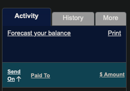
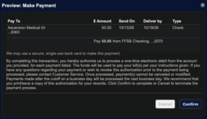
Today’s issue is a pair of buttons and some tabs. One button says Cancel and one says Confirm, but I can’t read the Cancel button. A similar pattern appears on the bill-pay screen’s tabs, shown on the left.
