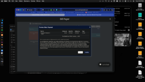
I didn’t expect to have much for you today. I’m back to producing, after one fill-in day as director on the show. I don’t actually have a segment, so I planned to look for stories to pitch later, clean out my inbox with some help from Claude, and – oh look, the new Apple home stuff is out. I think I have time to take a look.
But before I do that, I’ve been asked to pitch in with a reader – a short news story that fills a gap at the end of a segment. Since that went off without low-contact incident, it’s time to browse the new gadgets.
Incident 1
So I head over to apple.com, and what do you know? A new Apple TV, updated HomePod Minis and a HomeView display are all under the link that says Home.
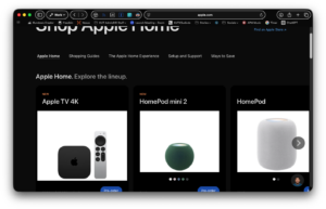
What’s this? White background boxes behind the new toys? Not a deal killer here, because the products themselves contrast well with the background. But thin lines or light colors in the photos can cause objects to blend into the background.
Incident 2
Man, I’ a slacker. I swear, non? of this happened until I had my reader written and pasted into the rundown. But after I had a look at Apple’s new toys, I visited Six Colors to see what Jason and Dan had to say about them. Then I scrolled back to read Phils latest app picks.
And nothing was difficult to read.
From Phil’s column I learned about Tidy, a little macOS doodad that cleans up icky filenames. I bought it for $9.
Still nothing wrong!
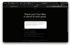
Remember when I mentioned download confirmation boxes in Safari? Here is one, and it’s white as the snow.
Incident 3
Y’all, I thought I was done! Workday’s over and I need to have a look at the Google doc that holds the editorial calendar for my classic film podcast, Lions, Towers & Shields.
I have several Google accounts, and I like the convenience of switching from one to another from within Google Docs. But this is new! All of a sudden, the list of accounts has a white background.
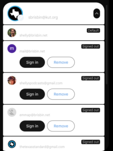
The worst part, though, is that doing the invert colors switcher results in text that blends into a dark background, making it completely impossible to read. I will allow as how some of this color weirdness could be caused by the way I’ve configured Dark Reader. You know, so I can read web pages at all! I have yet to explore what I might need to do to fix Google’s menu.
Incident 4
This just in, and it’s effing evil! Clicked on a Verge link from Mastodon. Not only was my article obscured by an obnoxious popup, the popup did not follow the site along to dark mode. So now I have a screen I can neither dismiss _or_ use as the site intends. I just left.
Behold!